

Book Cover Design
Book cover design
Packaging & print
Potato chip packaging.
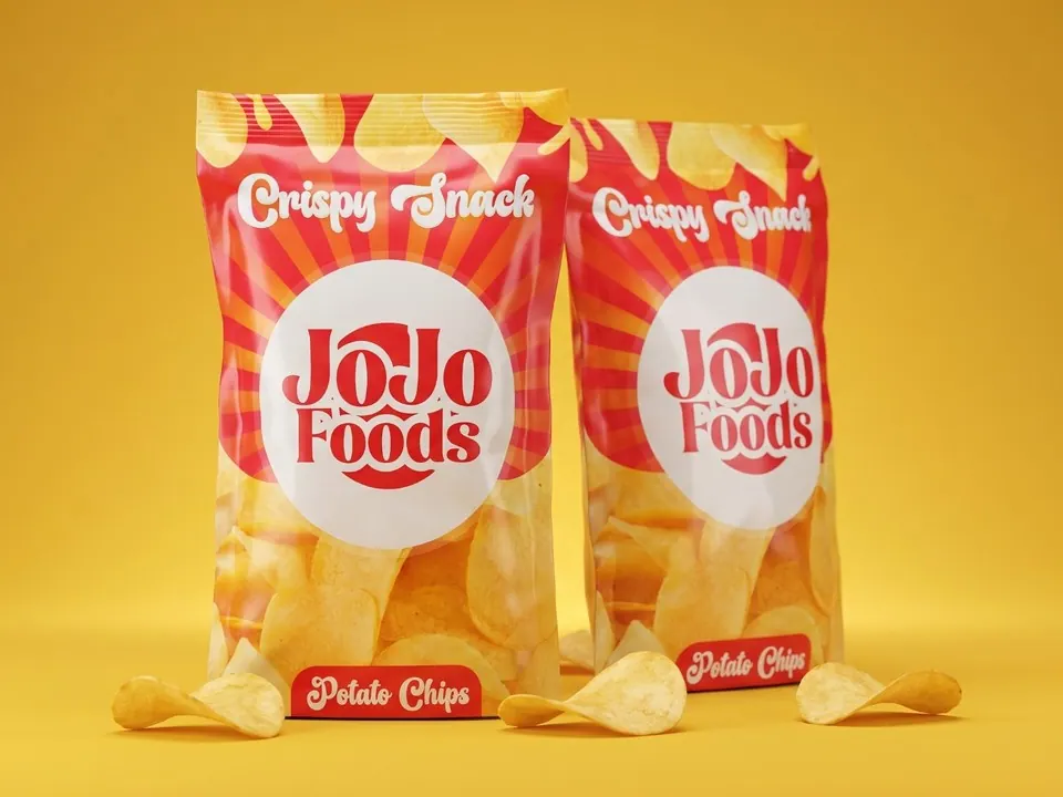
The snack aisle is loud. JoJo Foods needed a pouch that reads from across the shop, feels friendly rather than corporate, and still shows off the product inside.
We put the JoJo Foods wordmark on a cream roundel so it holds its own against a high-energy red and orange sunburst. A chunky retro script carries "Crispy Snack" and the "Potato Chips" tag, and a clear window shows the product through the middle of the pack.
A chip pouch design with a cream roundel logo, a red and orange sunburst, retro lettering and a clear window, shown in packaging mockups.
Tell us what you're working on. A few words is enough to start.
*No brief needed. Start with one sentence.