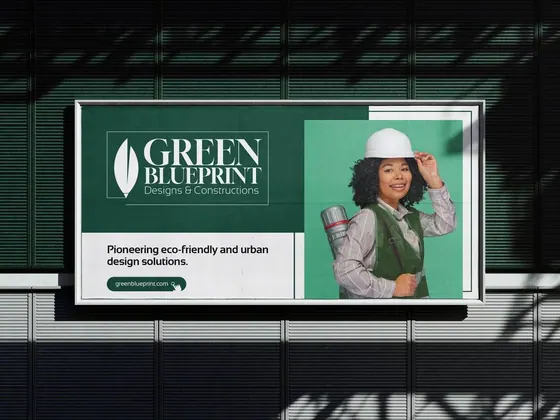
Green Blueprint
Logo and brand look for an eco-friendly construction company
Logos & brands
Brand identity for a fictional luxury home developer.
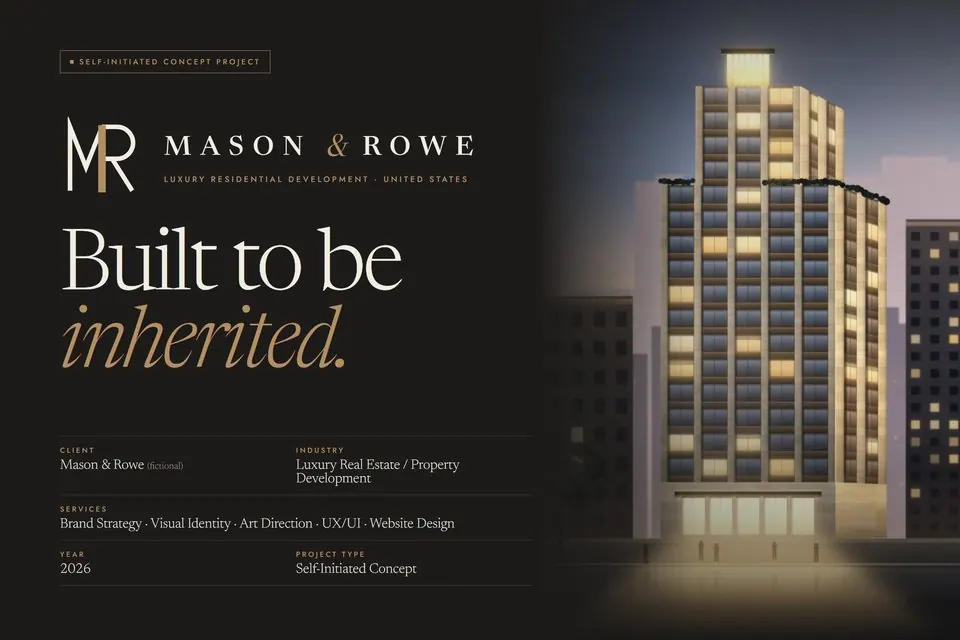
Luxury property brands tend to borrow the look of a brokerage: gold foil, stock palm trees and shouted superlatives. Mason & Rowe needed to read as an architecture and craft practice that happens to build homes in New York, Miami, Los Angeles and Austin, and to earn the trust of buyers who think in decades.
The monogram, The Shared Pier, joins an M and an R on a single vertical, the way a pier carries two arches. Ivory Plaster, Warm Limewash, Charcoal Basalt, Soft Travertine and Muted Bronze carry the system, every pairing is contrast-checked, and bronze has two companions for small text. Newsreader sets an editorial voice and Jost keeps it precise. A plan-grid graphic language (hairlines, dimensions, section marks) makes every image feel measured, and the art direction fixes the look of the imagery: blue-hour exteriors, true verticals and raking light on material.
A complete brand system: strategy and voice, monogram and lockups, usage rules, colour with live contrast ratios, typography, graphic system, photography direction, layout grid and applications from stationery and signage to a property brochure and digital advertising. Self-initiated concept; Mason & Rowe is fictional and every development, image and price is illustrative.
Tell us what you're working on. A few words is enough to start.
*No brief needed. Start with one sentence.