

Green Blueprint
Logo and brand look for an eco-friendly construction company
Logos & brands
Brand identity for a fictional small-business finance app.
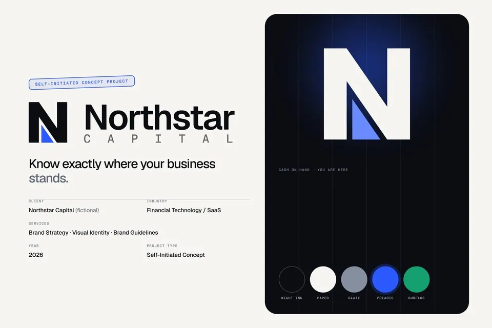
Fintech brands default to padlocks, dollar signs and teal gradients, and speak in jargon. Northstar needed to feel confident, intelligent and credible to owners who are not finance people, without looking like a bank or a generic SaaS template.
The mark is a bold, geometric N with a blue wedge inlaid in its counter: a compass needle, a sail, an arrow pointing north. Traced, the N is also a cash-flow line (up, down, up). Night Ink, Paper and Slate carry the system, Polaris Blue is the single accent, and Surplus green is reserved for positive money. Geist and Geist Mono set the tone, and four graphic devices (the north wedge, a meridian grid, the rise-dip-rise line and a data constellation) are all derived from the mark.
A complete brand system: strategy and voice, logo suite and usage rules, colour with contrast ratios, typography, graphic language, a custom icon set and applications from business cards to out-of-home. Self-initiated concept; Northstar Capital is fictional and nothing here is a real financial service.
Tell us what you're working on. A few words is enough to start.
*No brief needed. Start with one sentence.