

Green Blueprint
Logo and brand look for an eco-friendly construction company
Logos & brands
Brand identity for a fictional preventative health company.
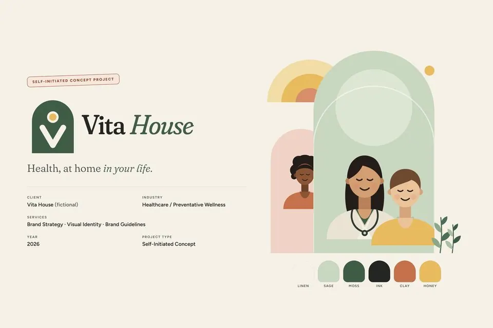
Healthcare brands default to cold clinical blue and institutional language. Vita House needed to communicate trust, warmth, professionalism and accessibility to young professionals and families, without looking or sounding like a hospital.
The identity rests on one idea: care that feels like coming home. The symbol, The Open Door, joins an arch (the house), a V (Vita: open arms and a rising shoot) and a honey sun. Warm neutrals, sage and deep moss carry the system, with clay and honey as quiet accents and no blue at all. Fraunces gives the voice warmth, Figtree keeps it clear, and every colour pairing is checked for accessible contrast. An arch-based graphic language, a custom icon set, illustrated portraits and photography direction complete the guidelines.
A complete brand system: positioning and voice, logo and lockups, colour, typography, photography direction, graphic language, iconography and applications from membership cards to signage. Self-initiated concept; Vita House is fictional and nothing shown is medical advice.
Tell us what you're working on. A few words is enough to start.
*No brief needed. Start with one sentence.