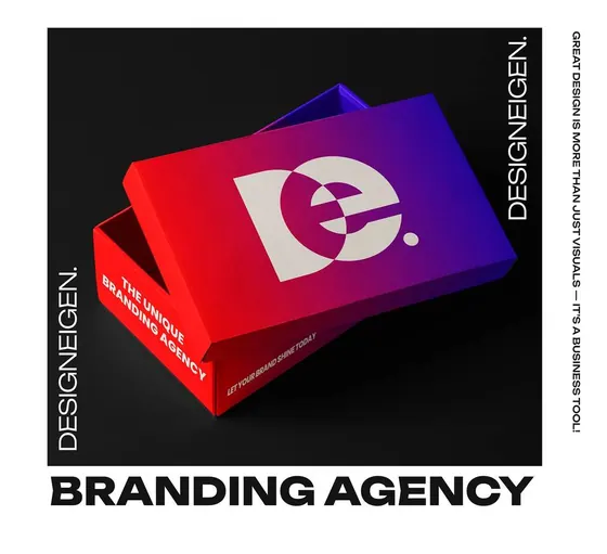

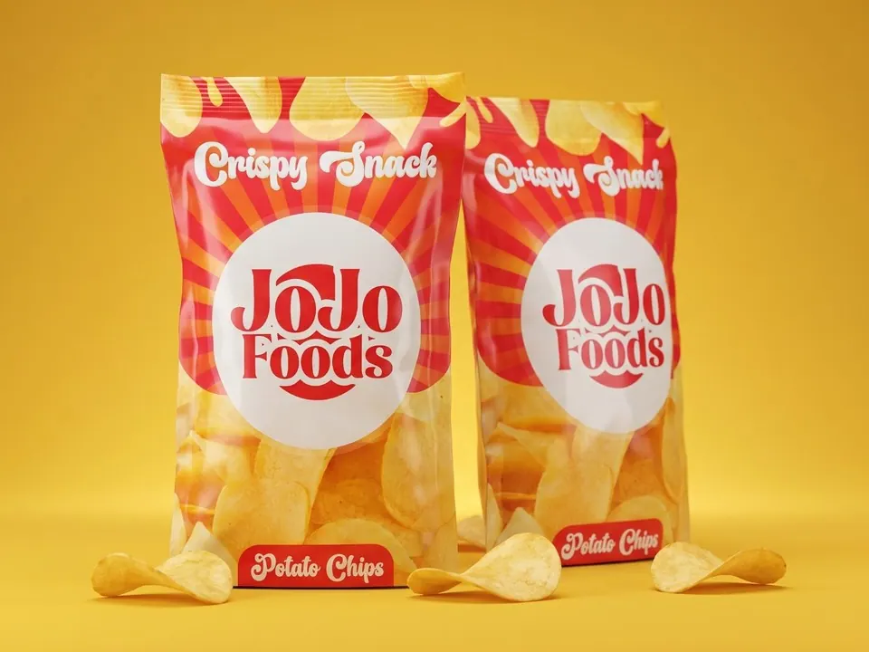
Whether it's a bag, a box or a label, people see packaging quickly and from a distance. So what matters changes. Here's where to put your effort.
1. A name people can read at arm's length
Your brand name and what's inside should be readable at a glance. Everything else is secondary. If someone has to hunt for it, they'll move on.
2. One colour idea
A strong, simple colour story is remembered long after small details are forgotten. Pick colours that suit the product and stand apart from the ones next to you.
3. Think about the real thing
A design that works on a flat screen can behave differently on a curved bag or a folded box. Ask your printer for dimensions and a template, and check the design against the real shape. If you want us to help, tell us what the packaging is made of.
Test it small
Print one, put it on a shelf or table, and step back. If the name still reads from across the room, you're close.