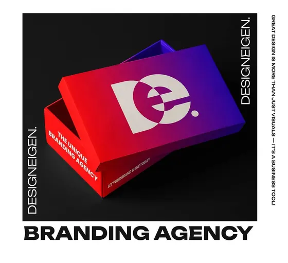


People notice colour before they read a single word, so the colours you choose do a lot of quiet work for your brand. The good news is you don't need many.
Start with how you want people to feel
Calm, energetic, trustworthy, playful, premium? Pick the feeling first, then look for colours that carry it. Blue often feels steady, yellow feels optimistic, dark tones feel serious. There are no rules, only habits people already have.
Keep the set small
- One main colour that people will remember
- One or two supporting colours
- One neutral for text and backgrounds (often a dark and a light)
Check the contrast
Text has to be easy to read on its background, on a phone in bright light as well as on a big screen. If two colours are close in brightness, people will struggle to read words placed on them.
Write the exact codes down
"Blue" turns into ten different blues the moment several people work on your brand. Keep the exact codes (like #162DAF) in one place and use them every time.
Test them in the real places
Put your colours on a sign, a business card and a social post before you commit. Colours can look different on screen and in print, so check both.